
3 scores max per player; No foul language, show respect for other players, etc.
Name | Score | Date | ||
|---|---|---|---|---|
| 1 | ||||
| 2 | ||||
| 3 | ||||
| 4 | ||||
| 5 | ||||
| 6 | ||||
| 7 | ||||
| 8 | ||||
| 9 | ||||
| 10 |
This is a timed game. Your final score is equal to the total score minus time taken.
Game: CHOOSE OR LOSE
Aim: Choose the right answer; beat the clock
Method:
You start the game with 50 points. Each question has 2 to 4 answers. Select the correct answer before your time runs out to score points. Right answers are +10, wrong answers are -2, out of time is -5.
This is a timed game. Your final score is equal to the total score minus time taken.


anonymous 😂😍😂
"Count down in steps of 5 to -100"
CHOOSE OR LOSE game to practice
'Polarity, strength of correlation' for 7th grade
7th grade / Statistics / Two variables / Scatter graphs / Polarity, strength of correlation
Polarity and strength of correlation for scatter graphs
Scatter graphs use dots or diagonal crosses to represent values that correlate the relationship between two variables. The scatter graph will indicate the degree to which the two variables are correlated (linked or related).
For instance, a scatter graph plotting altitude (x-axis) against Oxygen concentration (y-axis) will indicate a strong correlation between these two variables because Oxygen concentration reduces with altitude (the reason climbers can suffer from altitude sickness). On the other hand, a scatter graph plotting eye colour against exam results will show no correlation because these two variables have no causal relationship.
The polarity of a correlation can be characterised as "positive" or "negative". This indicates whether an imaginary straight line drawn through the points (a line of best fit) rises to the right (positive - as the x-axis variable increases, so does the variable on the y-axis) or falls to the right (negative - as the x-axis value increases, the y-axis variable decreases). So, thinking about our example of altitude plotted against Oxygen concentration, we will see a negative correlation because the concentration decreases as the altitude increases. A positive correlation would be seen if we plotted a child's age against shoe size: as their age increases, so does their shoe size.
The strength of a correlation can be characterised as "strong" or "weak". A strong correlation will be indicated on a scatter graph by points that closely follow a line of best fit. A weak correlation will show points that are more loosely concentrated around a line of best fit.
In this topic you are asked to decide which of the descriptions provided best describe the correlation between the variables plotted on the x and y axes. The possible options are:
- Strong positive correlation
- Strong negative correlation
- Weak positive correlation
- Weak negative correlation
- No correlation
With our Choose or lose math game you will be practicing the topic "Polarity, strength of correlation" from 7th grade / Statistics / Two variables / Two variables. The math in this game consists of 16 questions that ask you to identify the polarity and strength of any linear correlation for each of the given scatter graphs.
Our CHOOSE OR LOSE game is a simple activity to help secondary math learners and will improve the speed at which you can solve problems in the given topic. It does not rely on the learner typing in the answer. Rather, the learner must choose the correct answer from a list of 2, 3 or 4 similar answers.
CHOOSE OR LOSE encourages faster problem-solving for common and vital secondary math topics. CHOOSE OR LOSE is a timed game with a leaderboard for each topic at each of the 4 levels on offer. You can play the game with or without audio and robots.
UXO * Duck shoot * The frog flies * Pong * Cat and mouse * The beetle and the bee
Rock fall * Four in a row * Sow grow * Choose or lose * Mix and match
Latest leaderboard entries: Choose or lose


How to play Choose or lose to practice
'Polarity, strength of correlation' for 7th grade

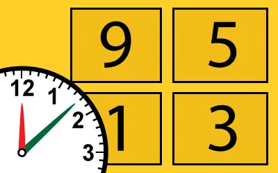
Our CHOOSE OR LOSE game asks the learner to click on the correct answer from a selection of possible answers before the clock runs down.
- Click on PLAY to start.
- You are presented with a topic question, then a list or grid of 2 to 4 possible answers (depending on the topic you have chosen).
- You must select the correct answer by clicking on it before the clock counts down.
- You have 10 seconds in total to answer each question.
- The clock starts ticking down 5 seconds after the answers have appeared.
- To hear the question again, click / tap on the question box.
- The browser will speak the potential answers on rolling-over them.
- A correct answer gains you 10 points.
- A wrong answer loses you 2 points.
- A time-out loses you 5 points.
- A score is kept of correct answers against number of answers.
- The game is timed, and your final score (points earned minus time taken) is given at the end of the game. Top 10 scores for a topic get you a place on the leaderboard.


